| Forms | ||
|---|---|---|
| Previous | Next | |
| External Search | Homeplaces (Target Selectors) | |
Forms enable you to add, modify, and delete content in the iKnowBase portal. You use the form component to configure the forms to use in your iKnowBase application. At run time an advanced form generator builds forms as required based on the configured form components.
There are two types of forms, regular content forms and process-specific task forms.
Content forms are used for publishing and editing content, such as documents or other information objects, in the iKnowBase content store. A form must be associated with one information type. You will need at least one form per information type that should be available for publish and maintenance in your iKnowBase application. Default behavior of a content form is to write its form identification to the information object upon saves. The next time the information object is opened for edit, the form which was last used to edit it will be used.
In order to use a content form, you must create a page with a Form portlet and a Target for this page. Configure the content form to use this target (target on show). Note: This target may be reused for different forms.
Task forms are used to carry out manual tasks in a BPEL process. You can configure a task form to write content to the iKnowBase content store as well as writing to the human task in the BPEL process. This will be done upon completion of a human task. You can also configure it for intermediate storage of values to a temporary document in the iKnowBase content store. This temporary document will be deleted upon completion of the human task.
In order to use a task form it must be mapped to the appropriate human task using the mapping tables of the iKnowBase Process Framework. See Development Guide for further information. You must create a page with a Java form portlet and a Target for this page. Then you must create a page with a Task viewer portlet which is configured to use this target.
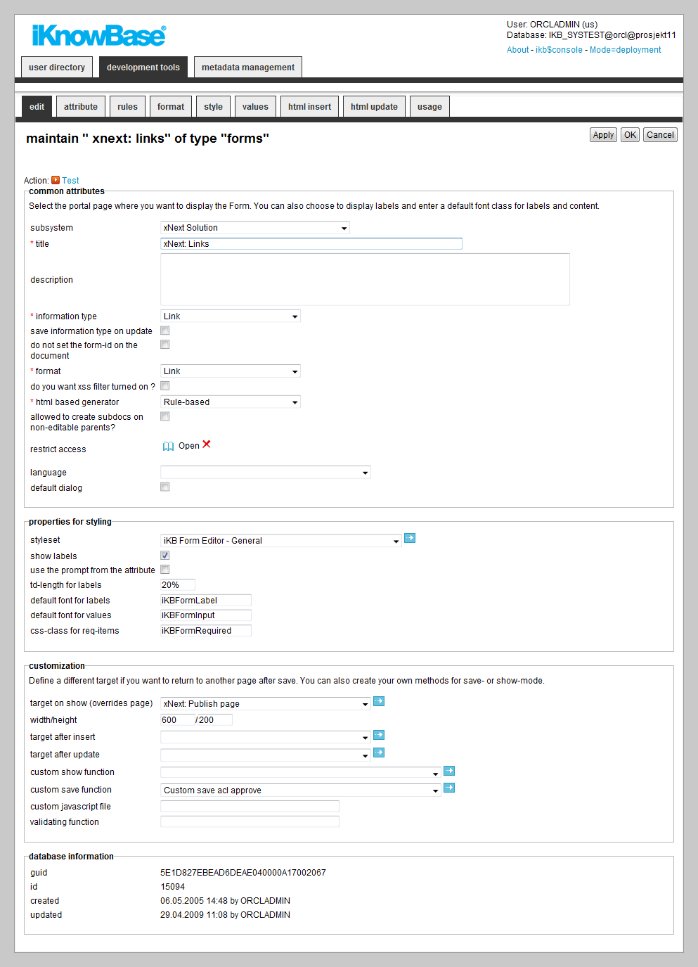
This section describes the properties of a form, as shown on the corresponding Edit pane tabs.
Note: This section covers both content and task form. The properties of both form types are largely congruent. Differences are stated explicitly.
| Property | Description |
|---|---|
| Subsystem |
Select the appropriate subsystem. |
| Title |
Type a title for this form. |
| Description |
Type a description for this form. |
| Information type |
Select the information type to use for documents created using this form. For a task form this is the information type that will be used for the temporary iKnowBase document used for temporary storage. |
| Save information type on update |
Select this check box if you want to update the information type of the document when the document is modified. Otherwise, the information type is only set for new documents. This feature enables you to change information type for an existing information object. |
| Do not set the form-id on the document |
Select this check box, if you don�t want to save the form identification together with the document. Default behavior is to write the form identification to the document upon each save. Not applicable for task form. |
| Format |
Select the appropriate content format.
Note: File and Link are not supported for task form. |
| Do you want XSS filter turned on? |
Select this check box to specify the use of a cleaning routine which deactivates all attempts on cross site scripting (XSS). Primarily for forms to be used in an open solution such as response forms. XSS is used by hackers to enter an executable JavaScript code that executes after a period of time. |
| HTML based generator |
Select the appropriate form generator for generating the form at run time.
|
| Allowed to create subdocs on non-editable parents? |
Select this check box to override the edit permissions for the parent document. This will enable the end user to create a sub document for a parent document he doesn�t have edit permissions for. If not selected, the security model in iKnowBase validates the new sub-document to ensure that you have edit permissions for the parent document (the document that becomes the master document). Not applicable for task form. |
| Restrict access |
Select the appropriate access control list. To access and use the form, the user must be a member of this access control list, and must also have the permission to publish content. If you do not specify an access control list, everyone can access the form. For task forms this applies to the document used for temporary storage of values. |
| Language |
Select the appropriate language for the form. If you do not select a language, it is automatically set according to: a) the user language, b) the browser language, c) the domain language in the given order. |
| Default dialog |
Select this check box to edit the documents that have no forms associated with them. iKnowBase searches for forms with the same document type or format, and selects the first form with this property set. |
| Styleset |
Select styleset to use for this form. For all form generators the header- and footer text apply. The following tags apply just for the rule-based generator:
|
| Show labels |
Select this check box to make the labels of the attributes visible in the form. If you do not select this check box, only the input field appears. |
| Use the prompt from the attribute |
Select the check box to retrieve the labels from the attribute definitions. |
| TD-length for labels |
Displays the default width of the
|
| Default font for labels |
Type the standard font classes for the labels. You can use this value when you create a new form or insert new attributes. If you change this value, none of the existing attributes for the form are affected. |
| Default font for values |
Type the standard font classes for the value field. You can use this value when you create a new form or insert new attributes. If you change this value, none of the existing attributes for the form are affected. |
| CSS-class for req-items |
Type the CSS class that is used in the mandatory fields in the form. |
| Target on Show or select a page |
Select an iKnowBase target or an Oracle Portal page. This is used as the location for displaying a form, when the form is opened as a separate page or as a popup page. Note: iKnowBase target is preferred over Oracle Portal page, the latter is kept for compatibility reasons. Not applicable for task form. |
| Width |
Enter the width of the popup window used when the form is opened as a popup page. |
| Height |
Enter the height of the popup window used when the form is opened as a popup page. |
| Target after insert |
Select the iKnowBase target that will be opened when a document has been inserted from this form. For task form this target is used after temporary storage. You can also override the default behavior if you want a JSON object as a return value when you save the document. This is ideal for forms opened with EXT where you programatically keep the control of the windows. To do this, you need to add a hidden input control to the HTML insert form (p_return_type = JSON) |
| Target after update |
Select the iKnowBase target that will be opened when a document has been updated from this form. You can also override the default behavior if you want a JSON object as a return value when you save the document. This is ideal for forms opened with EXT where you programatically keep the control of the windows. To do this, you need to add a hidden input control to the HTML update form (p_return_type = JSON) For task form this target is used after completion of a task. |
| Custom show function |
For advanced use only, you can create a specific PL/SQL procedure to generate the iKnowBase form. Select the appropriate Database function if you want to override the default. Note: The default database function for generating a form is ikb_ce_custom_editor_portlet.run_show. You can copy this as a starting point for you own custom show function, and then customize it. You must register you new procedure as a Database function. Not applicable for task form. |
| Custom save function |
For advanced use only, you can create a specific PL/SQL procedure to handle saves through this form. Select the appropriate Database function if you want to override the default. Note: The default database function for save through Form is ikb_ce_custom_editor_portlet.save_document. It handles the save and navigation after the save. You can copy this as a starting point for you own custom save function, and then customize it. You must register you new procedure as a Database function. Not applicable for task form. |
| Custom JavaScript file |
Enter the URL for a custom JavaScript file, which will be included in the form by the iKnowBase forms engine. The URL will be passed on to clients without conversion, and must be accessible from any web client. |
| Validating function |
Type the name of the JavaScript function that you want to use for the additional validating functions. Use the complete URL or relative path that is known to the application server such as /resource/file.js. Default validating function validates required fields and input-format for date fields. The function does not take any parameters and returns either TRUE (Validating OK, continue) or FALSE (Validating not OK, terminate). Example: |
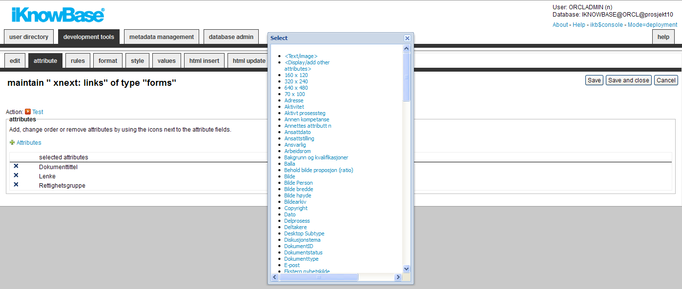
You can add, change the order of, or remove attributes from the form. When you create a form, all the attributes related to the information type selected for the form are added as suggestive values.
| Property | Description |
|---|---|
| Attributes |
Defines the attributes included in the form. Select new attributes by clicking the link Attributes. You can reorder the attributes by drag/drop functionality.
The
The
This mechanism makes it possible to allow custom attribute combinations on a document, without having to create forms for every possible combination of attributes. The “Format” attribute is available if you select Optional format for the form. This attribute enables the end user to select the content format at runtime. Remember that you also need to select the content attributes (file, link or content) that you will let the user choose from. The Folder attribute enables the end user to change the parent document. |
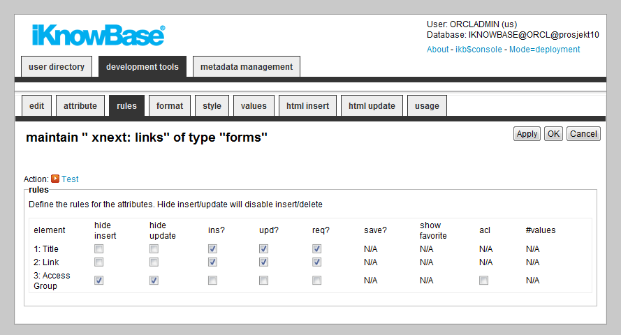
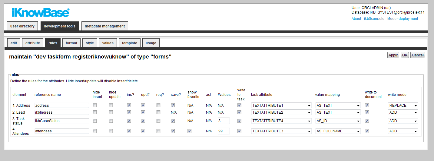
The Rules tab enables you to define behavior and validation rules that apply to each attribute.
The rules tab of a task form contains more properties than a regular content form. Therefore screenshots of both content- and task form are included.
| Property | Description |
|---|---|
| Element |
List of all attributes in the form. |
| Reference name |
A logical name used by the Freemarker engine. Not applicable for content form. |
| Hide insert |
Select this check box to hide this field, when new documents are created. Not applicable for task form. |
| Hide update |
Select this check box to hide this field, when existing documents are updated. Not applicable for task form. |
| Ins? |
Select this check box to allow the user to enter values while creating documents. Does not apply if
If unchecked, the field will display, but no be editable. For the special attribute
|
| Upd? |
Select this check box to allow the user to enter values while updating documents. (Does not apply if
If unchecked, the field will display, but no be editable. For the special attribute
|
| Req? |
Select this check box to specify if the attribute is mandatory (required) while creating a new document. |
| Save? |
Select this check box to save this attribute in iKnowBase. In some cases, an attribute is used only during forms processing, and may be processed by a custom save function. An example would be a checkbox indicating whether to send an e-mail: The custom save function will use the value, but it should not be saved on the document. For a task form, checking this box will make iKnowBase store the value into the temporary iKnowBase document. |
| Show favorite |
Used for dimension attributes only, select this check box to display the favorite values for dimension attributes in a list. The list displays the last ten values that the user used for an attribute. |
| Acl |
Used for the ACL attribute only, select this check box to enable the user to create access control lists. |
| #values |
Displays the number of values a user can enter for this attribute. The value is retrieved from the attribute definitions, but can be overridden. |
| Write to task |
Checkbox indicating whether these attributes should be written back to the manual task entry in the BPEL process engine. The field is written to the manual task only when the task is finalized by setting an outcome. Not applicable for content form. |
| Task attribute |
When selected, indicates where the task attribute should be written. Click the appropriate task attribute. Note: If a user does not configure this property correctly, the user of the task dialog receives an error when the task dialog is used. The task attribute that must be used is self evident, with the exception of the following: AS_PERSONCARD requires a numerical attribute, because it is the document ID of the Person card that is written. For fields allowing multiple selection, you must select a BPEL text attribute, since multiple values are written to the task as a semicolon separated list. Not applicable for content form. |
| Value mapping |
Select the appropriate value with which the field is mapped with the task. For example, for a text attribute, the field can be written only as text. Not applicable for content form. |
| Write to document |
Select this check box to write the field to the iKnowBase document that initiated the BPEL process instance. The field is written to the iKnowBase document when the task is finalized by setting an outcome. Not applicable for content form. |
| Write mode |
Select the appropriate write mode. The write mode describes how to write the field to the iKnowBase document that initiated the BPEL process instance, e.g. whether to replace existing attributes or add new ones. Note: The Add mode is relevant only for the document attributes of the type: Dimension, Value list, or External attribute. The selections is not filtered in the user interface. Not applicable for content form. |
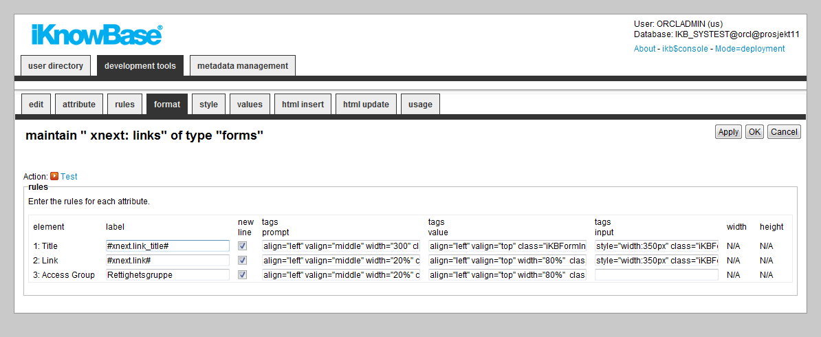
The format tab lets you enter formatting rules for each form item.
| Property | Description |
|---|---|
| Element |
Displays the name of the attribute. |
| Label |
Type a label for the attribute. This property will be used when you have selected the Show label property and deselected the Use the prompt from the attribute property on the Common attributes tab. You may use HTML codes in this field. Note: This property doesn�t have language support. You may use labels stored in the NLS tables to achieve this. The syntax is #ObjectId.StringId#, where ObjectId is the value in the IKB_NLS_STRING.OBJECT_ID column and StringId is the value in the IKB_NLS_STRING.STRING_ID column. The NLS tables may be overwritten in case of an upgrade. |
| New line |
Select this check box to add the attribute to a new line. |
| Tags prompt |
Type the HTML tags that display the labels. If the code does not have the correct syntax, there can be an error when the form is generated. By default, the field gets the values from Default font for labels and TD-length for labels property. Using this format value: renders this HTML-code: |
| Tags value |
Type the HTML tags that display the value field. If the code does not have the correct syntax, there can be an error when the form is generated. By default, the field gets the values from Default font for labels and TD-length for labels property. Using this format value: renders this HTML-code |
| Tags input |
Type the HTML tags that are used within input fields that are generated. For example, the size of a select box that can be specified with a font class or a style tag directly (style=“width:249px”) Using this format value: renders this HTML-code |
| Width and Height |
Type the width or Height of the text field for CLOB attributes (ingress and body text). The selected style decides the measuring unit that you must use.
|
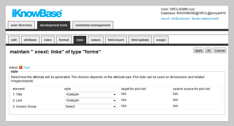
The Style tab lets you select the input type of the selected attributes.
| Property | Description |
|---|---|
| Element |
Displays the name of the attribute. |
| Style |
Select the appropriate style. This property specifies how the input field is generated. The available options depend on the attribute type.
|
| Target for pick list |
Select the target where your pick list is placed. This target is used when you select the pick list as a style (only for Dimensions, Folder, and Related objects or images). |
| Search source for pick list |
Select the pick list that is used to select dimensions or documents. This search source is used where you have selected a pick list as a style (only for Dimensions, Folder and Related objects or images). Note: For related objects or images, the picklist must return document IDs. For dimensions, the picklist must return dimensions. |
It is possible to specify default values for the various form attributes.
Per attribute you can create a subset of values that will be available for the end user during categorization, as well as defining a default value which will be prefilled in the form when the user opens it to create a new document.
Note: You can use SQL functions to calculate values. Example:
#to_char(sysdate,'DD.MM')
Parameters are used to receive values from a URL that calls the form. You can choose if you want to use a parameters while creating a document or updating a document through a form, or in both modes.
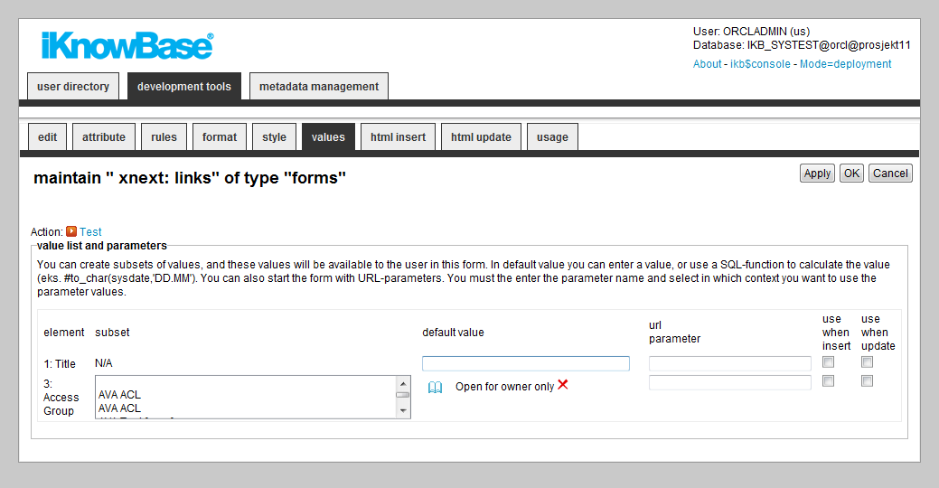
| Property | Description |
|---|---|
| Element |
Displays the name of the attribute. |
| Subset |
Define a subset of values for an attribute to limit the values that a user can choose. You can define subsets for the following attribute types: value lists, dimension, status codes, access control lists and templates. Note: In order to be able to define a subset for a dimensional attribute, you must define a style other than dimension navigator or picklist for the dimensional attribute. For dimensional attributes you can select a subset with the dimension navigator. For the other attribute types you can select a subset of values from the list box. Default value Type the default value for the attributes when a document is created. For text fields, type a value in the field. For dimension values, select the desired value. If the style is different from the dimension navigator, you must select a value from the subset. These values are available when the subset is created. If the dimension navigator is available, you can select the values from the dimension selector. For lists, select the appropriate value in the drop down box. You can also specify a function to retrieve a dynamic default value. You must always specify functions with the character # before the function name. The function can be either an SQL function such as TO_CHAR or a stored PL/SQL function. You can also send context-based parameters. Available variables are:
Examples: To return today�s date: To run the function �get_process_state", sending the current document�s parent_id as the parameter: |
| URL parameter |
Type the URL parameter to set the suggested value to the current field over the URL string. The value differs between parameters that are active when documents are created or updated. The URL parameters override any default values. The URL is built upon the quick link where the parameter is given a value. It is available for selection on the Parameters tab on the Edit pane of a quick link. |
| Use when insert |
Select this check box to insert the URL parameter when documents are created. |
| Use when update |
Select this check box to insert the URL parameter when documents are updated. |
| Attachment |
The Attachment attribute lets you attach subdocuments to the document being edited in the form. At run time, users can upload multiple files as attachments to the current document. They will not use a separate form to edit the metadata for the attachments. At design time, you need to select the form to use for later editing of the attachment. This form also defines the information type (document type) and possible attributes of the attachments. You can also choose to display already existing attachments by checking �display existing attachments". All sub documents created with the form provided in �select form for attachments" will be displayed. If you want to remove the �delete"-link, simple create the form as a HTML-form, generate HTML code for update and remove the tag �DELETE_ATTACHMENT". |
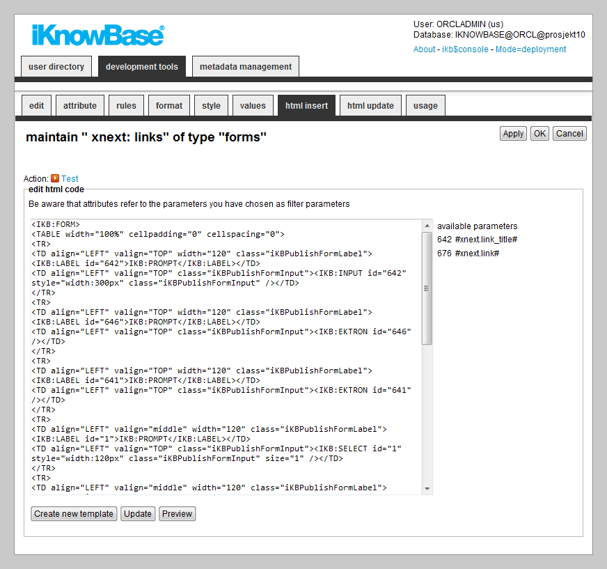
iKnowBase enables you to design and create the content form layout using your own HTML markup, rather than using the automatically generated forms. The notation in the setup is based on HTML with several extensions to generate dynamic fields for iKnowBase. See chapter 1.108 HTML Template support for further information.
You can write the HTML template code in the HTML Insert and HTML Update tabs. The HTML Insert code is used to generate the form for a new document, the HTML Update code is used to generate the form for an existing document.
Note: If you update the selected attributes in the form, you must also update the HTML templates to reflect the changes. You can generate a new template or manually update the template, and insert IKB tags for new attributes or delete old tags.
There are three action buttons available:
These properties are only applicable for content form.
| Property | Description |
|---|---|
| HTML code |
Type the HTML template code.
|
| Available attributes |
A list of available attributes and their IDs available for use in the HTML template code. |
iKnowBase enables you to design and create the task form layout using your own FreeMarker template. See the FreeMarker reference chapters and Task form for information about iKnowBase-specific model objects available for use in the FreeMarker template.
Note: If you update the selected attributes in the form, you must also update the FreeMarker template to reflect the changes. You can generate a new template or manually update the template.
There are two action buttons available:
These properties are only applicable for task form.
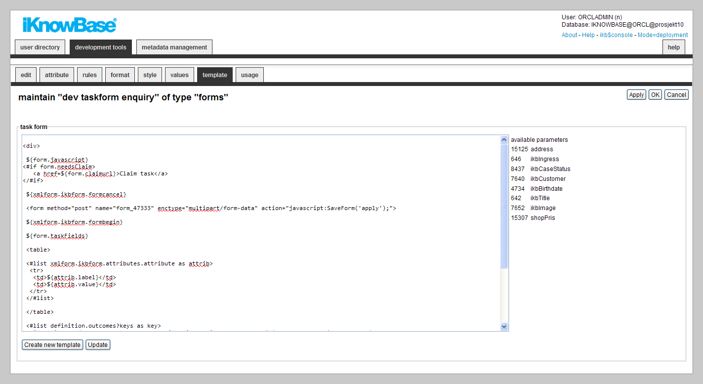
| Property | Description |
|---|---|
| Task form |
Type the FreeMarker template code. Note: Use the action buttons Create new template or Update to automatically create or update FreeMarker template code. |
| Available parameters |
A list of available attributes and their IDs available for use in the FreeMarker template code. |
To test your content form, either click the Test action for the form on the List pane, or click the Test action link on the Edit pane tabs for the form.
Note: The Test actions become available for a content form after you specify the target Target on show for the form.
This is only applicable for content forms.
| Previous | Top | Next |
| External Search | Homeplaces (Target Selectors) |