| Menus | ||
|---|---|---|
| Previous | Next | |
| Language | Mimetypes and formats | |
The menu component enables you to create menu structures which may be presented in various formats. You can create a new menu component, and then build its structure by creating submenus and menu items. You can link menu items to a portal page, URL, iKnowBase page, form, task wizard, or quick link. You can apply various menu styles, such as rollover effects, to menus, and insert images or icons to identify menu items.
In iKnowBase, you can create a menu either manually or by importing a menu structure from an existing dimension tree.
Use the menu portlets to make menus available to users.
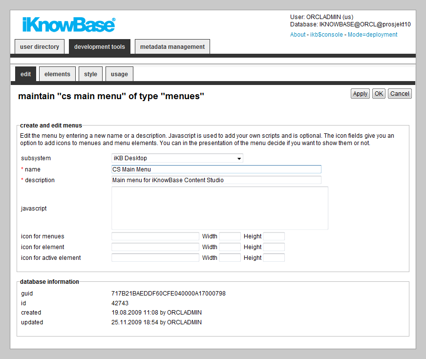
This section describes the properties of a menu, as shown on the corresponding Edit pane tabs.
| Property | Description |
|---|---|
| Subsystem |
Select the appropriate subsystem. |
| Name |
Type a name for this menu. |
| Description |
Type a description for this menu. |
| JavaScript |
Type JavaScript code which may be used from the portlet rendering the menu. The standard iKnowBase menu portlets don�t require any JavaScript code. This may be relevant if you write your own menu portlet. |
| Icon for menus |
Some of the presentation forms of menus support the use of icons. These are used slightly different depending on the form of presentation. Type the reference to the icon, together with its width and height, to be used for menus. The file must be reachable from the application server. |
| Icon for element |
Some of the presentation forms of menus support the use of icons. These are used slightly different depending on the form of presentation. Type the reference to the icon, together with its width and height, to be used for menu items. The file must be reachable from the application server. |
| Icon for active element |
Some of the presentation forms of menus support the use of icons. These are used slightly different depending on the form of presentation. Type the reference to the icon, together with its width and height, to be used for the active menu item. The file must be reachable from the application server. |
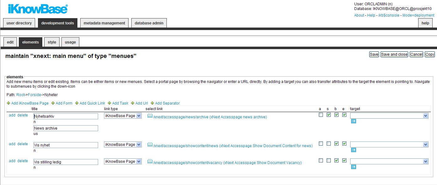
You can choose between six types of menu elements:
To change the menu item order, simply drag and drow the element where you want it.
| Property | Description |
|---|---|
| Down |
If subitems exists, the link will navigate to the next level |
| Add |
If subitems doesn’t exists, the link will navigate to the next level where you can add subitems |
| Delete |
Will delete (when Save or Save and Close is pressed) menu items or submenues. |
| Title |
Type the name of the menu, or the item that appears in the menu. If multiple languages are supported in the solution, each language displays in a separate input field. The language code is displayed behind the input field. |
| Link type |
Select the type of link that is connected to the menu item.
|
| Select Link |
Select the proper link destination. |
| A (all) |
For protected destinations, enabling this option will show the menu element regardless of login status. With this option deselected, protected destinations will only be shown to logged in users with the proper permission. When users who are not logged on are given access to protected pages, they will normally be asked to log on. |
| S (Sitemap) |
Check this option to allow the menu item to appear in a sitemap |
| B (Breadcrumb) |
Check this option to allow the menu item to appear in a breadcrumb. |
| E (Enabled) |
Check this option to enable the menu item. |
| Target |
Select target to be used. URL parameters may be used together with targets. If both Select link and Target are defined, the former will be passed as a parameter to the latter. |
| Property | Description |
|---|---|
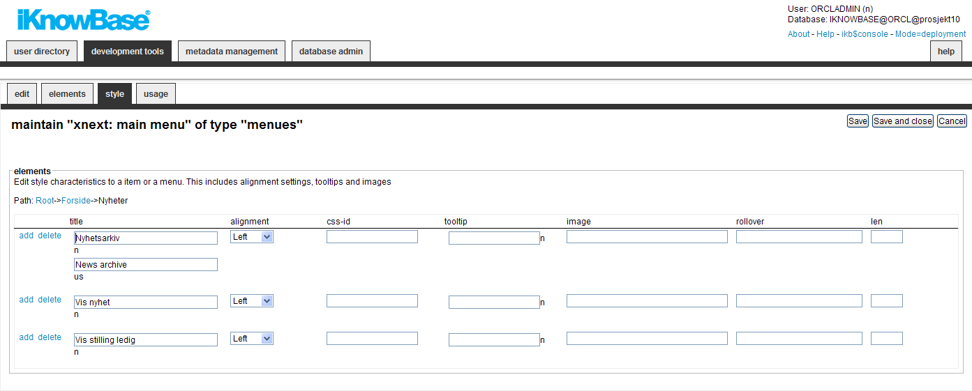
| Title |
Type the name of the menu, or the item that appears in the menu. If multiple languages are supported in the solution, each language displays in a separate input field. The language code is displayed behind the input field. |
| Alignment |
Select the appropriate alignment for the text. |
| CSS-ID |
Type the ID of the CSS class that is associated with the elements in the HTML code. This CSS class can be used for styling of the menu element. |
| Tooltip |
Type a tooltip for the menu item. If multiple languages are supported in the solution, each language displays in a separate input field. The language code is displayed behind the field. |
| Image |
Type the file path of the image that you want to display as the element. The file path is the application server path of the image file that is displayed. |
| Rollover |
For menus that support rollover effects, type the reference to the icon that is displayed. The file must be referenced so that it can be accessed from the application server. |
| Len |
Type the length of the image. This property is used for some presentation forms. |
If you choose to create a menu based on an existing dimension tree (Menu with import from iKnowBase), you will need to choose the starting dimension and number of levels to include. When you click Apply the menu will be created with menu elements corresponding to your specification.
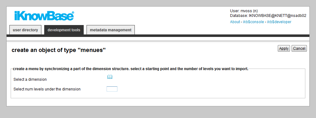
| Property | Description |
|---|---|
| Select a dimension |
Select a start node in the dimension tree. Node below this point will be imported into the menu structure |
| Select num level under the dimension |
The import will travese down to this level |
When you create a menu based on a subset of the dimension tree, iKnowBase will copy the dimension information into the menu structure. If the dimension tree changes, the menu will not change automatically.
Use the Synchronize menu link to re-synchronize a menu based on a dimension tree. When you select this command, iKnowBase will display the same input form as when creating the menu for the first time. Input the correct value, click apply, and iKnowBase will update the menu structure with updated dimension information.
| Previous | Top | Next |
| Language | Mimetypes and formats |