| Presentation Style | ||
|---|---|---|
| Previous | Next | |
| Parameter | Preview Pages | |
Presentation styles are used by viewers, task viewers and search sources to present data. While the viewer or search source decides which information objects should be shown, the presentation style decides which information to present and the look and feel of the data. By having them separate makes it possible to reuse presentation styles, and thus get a uniform look and feel across your portal.
iKnowBase supports four different types presentation styles, with different properties.
Be aware of the following: Tabular presentation style and free form style will in future releases be desupported. We recommend that you convert these styles to freemarker templates by using the Convert to template, either one by one, or as a bulk operation available from iKnowBase Studio/Development tools/Presentation styles. (You can by any time revert the style back to its original state.)
| Property | Description |
|---|---|
| Template |
Enables you to write your own FreeMarker code to format content. This template type can be customized more than the tabular form, but requires that you know FreeMarker. |
| Tabular form |
Displays data in a tabular manner (one row per document). It is fairly easy to set up, and you do not really need to know HTML to use it. Will be desupported in future releases. |
| Free form |
Older presentation style type, primarily for backwards compatibility. We do not recommend this type for new presentations styles. Will be desupported in future releases. |
| SOLR |
Used by SOLR viewers to enhance a result set from SOLR |
In the presentation style you must specify which data source the data should be extracted from. You can choose between data sources for the iKnowBase content store or BPEL Workflow, or external data sources which you define yourself.
When you specify en external data source, the columns defined for this external data source will be available as attributes in the presentation style. They can be presented with the same flexibility as iKnowBase attributes. They will be displayed as
<External: _ColumnName_>, where
ColumnName is the name that you have given the column in the external data source. If the external data source is independent, only the columns defined for the external data source will be available. Alternatively, if the external data source is dependent, the columns defined for the external data source will be available in addition to standard iKnowBase attributes.
When a presentation style which is set up with an external data source is connected to a viewer or a search source, it automatically builds an expression with the select, from, and where parts from the external data source. The parameters defined for the external data source will be available in the viewer and search source for building the where condition. They will be categorized as External parameters.
This section describes the properties of a template-based or SOLR based presentation style, as shown on the corresponding Edit pane.
| Property | Description |
|---|---|
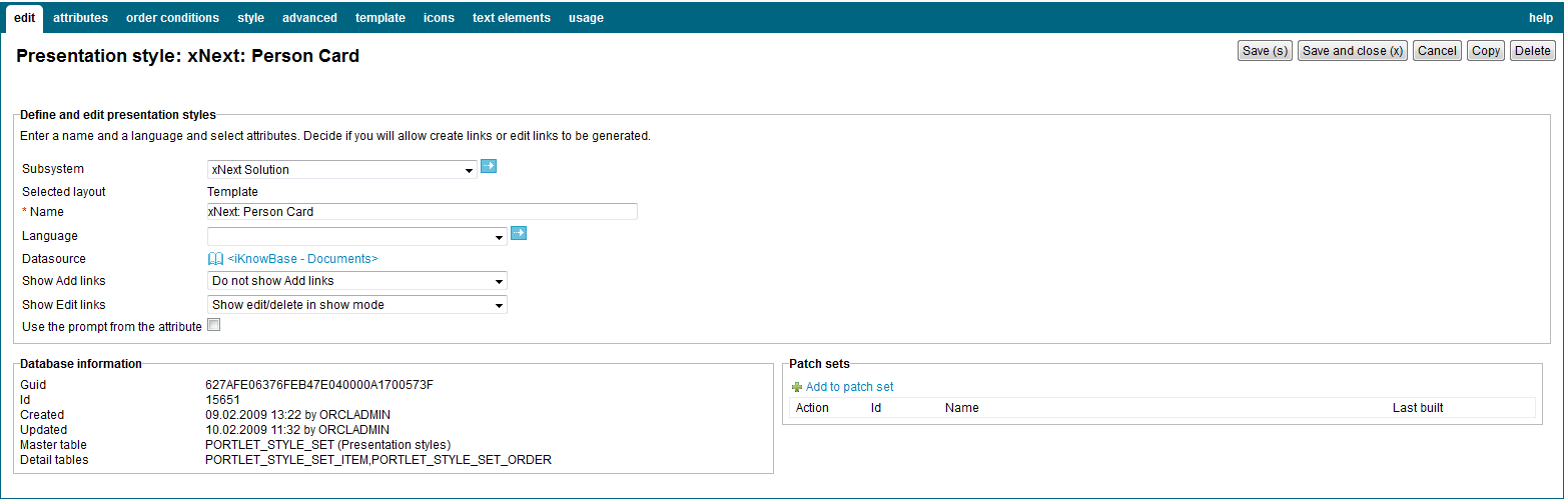
| Subsystem |
Select the appropriate subsystem. |
| Selected layout |
Displays the type of presentation style. |
| Name |
Type a name for this tabular form presentation style. |
| Language |
Select the appropriate language for the form. If you do not select a language, it is automatically set according to: a) the user language, b) the browser language, c) the domain language in the given order. |
| Datasource |
Select the appropriate data source for this presentation style. For SOLR the value is always set to <iKnowBase – Documents>. The following data sources are available:
In addition to these data sources you will also have access to select all defined external data sources. |
| Show Add links (only available for template based style) |
Specify whether to generate links to add new documents or not. The links is placed above the extracted documents at runtime.
Note: You need to specify which links to generate in the viewer or search source configuration (on the quick links tab on the Edit pane), and select the
The following options are available:
|
| Show Edit links (only available for template based style) |
Specify whether to generate icons to modify and delete documents or not.
Note: You need to select the appropriate attributes, such as
The following options are available:
|
| Use the prompt from the attribute |
Select the check box to retrieve the labels from the attribute definition. |
| Guid |
Displays a globally unique identifier number for this component. This property appears after you save a component. You cannot update the information of this property. |
| Id |
Displays a unique identifier number for this component. This property appears after you save a component. You cannot update the information of this property. |
| Created |
Displays when the component was created and by whom it was created. |
| Updated |
Displays when the component was last updated and by whom it was updated. |
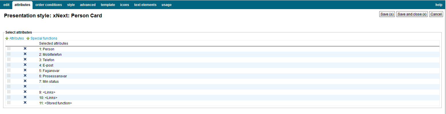
On the Attributes tab you can select the attributes or special functions to be used in the presentation style. Make sure to select only the attributes needed.
| Property | Description |
|---|---|
| Attributes |
Select among all regular attributes defined. Some of the attributes available from iKnowBase content store data sources are in fact special functions. |
| Special functions |
Select among all special functions defined.
You can reorder the attribute list by using drag and drop in each line. You can deselect attributes by clicking on the delete icon and save the data. |
Select the attributes to be used to order the result set. A order condition can either be a regular attribute or a database function. If the viewer extracts tree structures you can also define the sort order of the siblings.
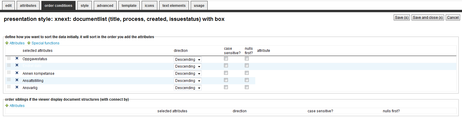
| Property | Description |
|---|---|
| Attributes |
Select among the attributes in the list. |
| Spesial functions |
Select among the database functions in the list. |
| Sort order |
You can reorder the conditions by drag-and-drop up or down. |
| Direction |
Decide the sort direction, either Descending or Ascending. |
| Case Sensitive |
Set to Checked if you want to do case sensitive search (e.g A and a is ordered differently) |
| Nulls first |
Set to Checked if you want to sort null values first (default is last) |
| Attribute |
Select an attribute if its needed by the database function |
| Siblings |
Only applicable if the viewer returns tree structured data and are used to order the siblings. |
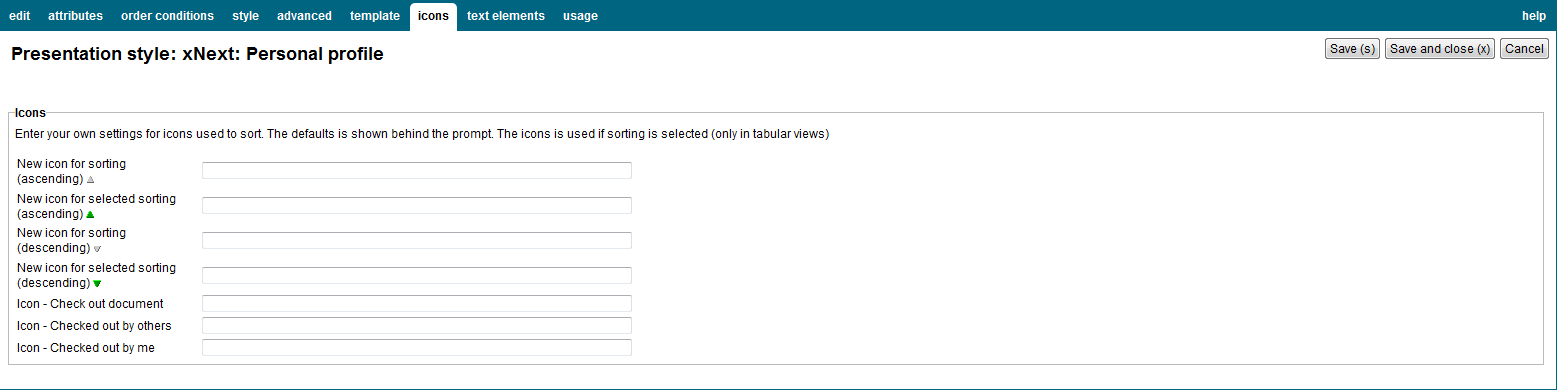
| Property | Description |
|---|---|
| New icon for sorting (ascending) |
Enter the path of the icon for an unselected ascending sort, for example /resource/icons/sortxx.png. |
| New icon for selected sorting (ascending) |
Enter the path of the icon for a selected (active) ascending sort, for example /resource/icons/sortxx.png. |
| New icon for sorting (descending) |
Enter the path of the icon for an unselected descending sort, for example /resource/icons/sortxx.png. |
| New icon for selected sorting (descending) |
Enter the path of the icon for a selected (active) descending sort, for example /resource/icons/sortxx.png. |
| Icon – Check out documents |
Enter the path of the icon for the “check out documents” command. You can click the icon and check out a document. |
| Icon – Checked in by others |
Enter the path of the icon to display this status. A ToolTip displays the name of the user who checks in a document and the time of check-in. |
| Icon – Checked in by me |
Enter the path of the icon to display this status. You can click the icon and check in a document. |
| Property | Description |
|---|---|
| Attribute |
Displays the list of selected attributes. |
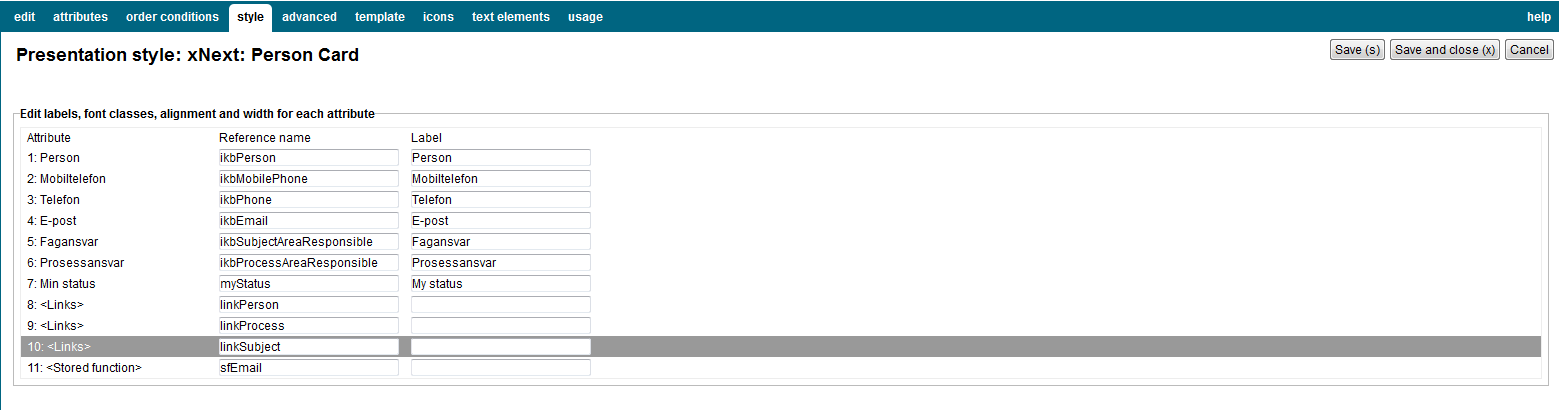
| Reference name |
Type the reference name of the attribute. If you want to identify the attribute in the template, you must provide a reference name. This reference name must be unique. |
| Label |
Type the label that you want to display for the specific attributes. Note: It is recommended to use text elements rather than the Label property. This property doesn’t have language support. |
| Property | Description |
|---|---|
| Title elements | |
| Show title |
Select this check box to display the document title itself. Rather that displaying the document title, you can display a label or image for the title attribute. For this, you must define the label or image in the Label property on the Style tab. |
| Restrict format |
Select the appropriate format restriction.
|
| Link type |
Select the appropriate link type.
|
| Link to |
Select the appropriate option to display the document when the user clicks on the title link.
|
| Tooltip |
Select the appropriate tooltip function. You can use the tooltip to preview an image or display the details of a document. New tooltip functions may be implemented as PL/SQL functions. Have a look at IKB_TOOLTIP.SHOW_ADVANCED_TOOLTIP_INGRESS as an example implementation. Register the new functions in the database table IKB_TOOLTIP_FUNCTION to make them available in the dropdown box. |
| Regular items | |
| Show/Hide |
Select whether you want to display or hide the attribute. |
| Database function |
By default, iKnowBase applies a default format to the item being displayed. If you want to customize this output, create a database function and use that for column formatting. Normally, you will not need to use a function. For more information on properties of database function, see Properties. |
| Image size |
Select the appropriate size for the image attribute. This property is available only for image attributes. |
| Links | |
| Link to |
Select the attribute value to pass as parameter. |
| Text source |
Select the text to be displayed on the link. Available options are the label for the
|
| Target |
Select the target to use for the link. |
| Image |
Type the path of an image to as the link. This will override Text source. The text specified in Text source will be used as tooltip for the link. The image must be placed under the resource directory. |
| Stored function | |
| Show/hide |
Select whether to display or hide the title attribute. |
| Package/function |
Select the database function. |
| Attribute |
Select the attribute to pass as parameter to the database function. Use the option
Note: If the function is not a simple function, it must have the signature described in
|
| Text/image | |
| Image |
Type the path of an image. For example, /resource/image.gif. The image appears instead of the label. |
| Height |
Type the height of the image in pixels. |
| Select quick link |
Select the appropriate quick link to use for this link/icon. Applicable to
|
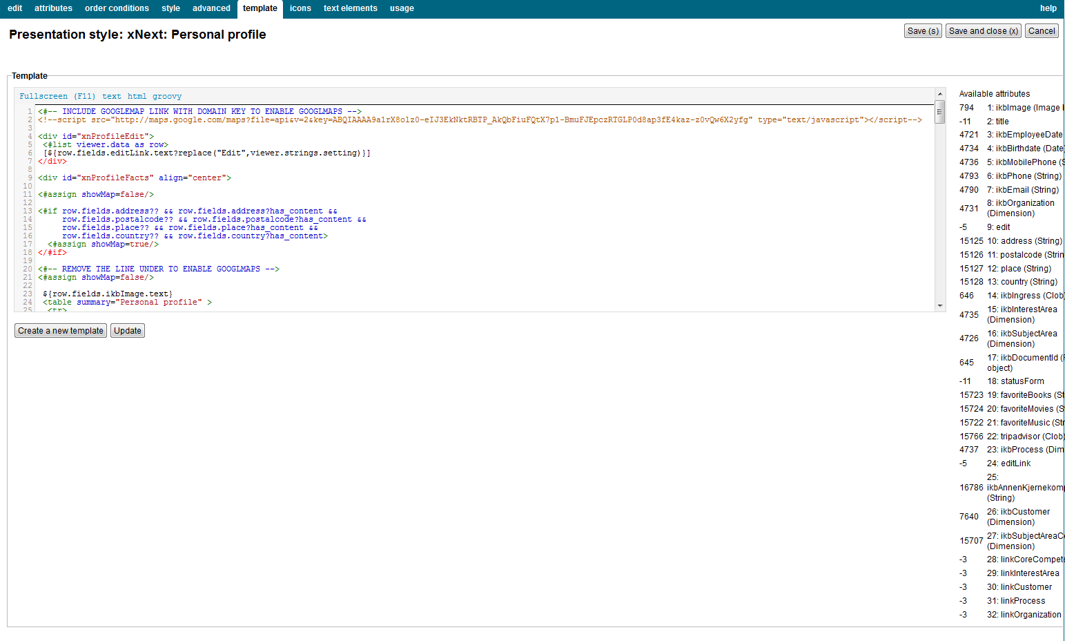
iKnowBase enables you to design and create the template-based presentation style layout using your own FreeMarker template. See the FreeMarker reference chapters for information about iKnowBase-specific model objects available for use in the FreeMarker template.
Note: If you update the selected attributes in the presentation style, you must also update the FreeMarker template to reflect the changes. You can generate a new template or manually update the template.
There are two action buttons available:
| Property | Description |
|---|---|
| Template |
Type the FreeMarker template code. |
| Available attributes |
A list of available attributes and their IDs available for use in the HTML template code. |
The properties on this tab enable you to define texts to be used in the component. The texts are available as FreeMarker model objects. Multiple languages are supported.
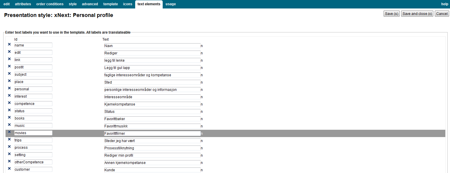
| Property | Description |
|---|---|
| Id |
Type an identifier for the label. |
| Text |
Type the text labels that you want to use in the template. If multiple languages are supported in the solution, clicking on the text box will display one text box per language, for easy editing. |
The free form presentation style is only available for backward compatibility purposes; this document therefore does not fully describe this feature.
The FreeForm presentation style does not apply any of its own HTML formatting on the content. Instead, you need to use the property
<Text/image> to enter the HTML formatting you want. At runtime, the viewer will output the formatting specified on the Style tab for each document in the source content.
| Previous | Top | Next |
| Parameter | Preview Pages |