| Presentation Style | ||
|---|---|---|
| Previous | Next | |
| Parameter | Preview Pages | |
Presentation styles are used by viewers, task viewers and search sources to present data. While the viewer or search source decides which information objects should be shown, the presentation style decides which information to present and the look and feel of the data. By having them separate makes it possible to reuse presentation styles, and thus get a uniform look and feel across your portal.
iKnowBase supports three different types presentation styles, with different properties.
| Property | Description |
|---|---|
| Tabular form |
Displays data in a tabular manner (one row per document). It is fairly easy to set up, and you do not really need to know HTML to use it. |
| Template |
Enables you to write your own FreeMarker code to format content. This template type can be customized more than the tabular form, but requires that you know FreeMarker. |
| Free form |
Older presentation style type, primarily for backwards compatibility. We do not recommend this type for new presentations styles. |
In the presentation style you must specify which data source the data should be extracted from. You can choose between data sources for the iKnowBase content store or BPEL Workflow, or external data sources which you define yourself.
When you specify en external data source, the columns defined for this external data source will be available as attributes in the presentation style. They can be presented with the same flexibility as iKnowBase attributes. They will be displayed as <External: ColumnName> , where ColumnName is the name that you have given the column in the external data source. If the external data source is independent, only the columns defined for the external data source will be available. Alternatively, if the external data source is dependent, the columns defined for the external data source will be available in addition to standard iKnowBase attributes.
When a presentation style which is set up with an external data source is connected to a viewer or a search source, it automatically builds an expression with the select, from, and where parts from the external data source. The parameters defined for the external data source will be available in the viewer and search source for building the where condition. They will be categorized as External parameters.
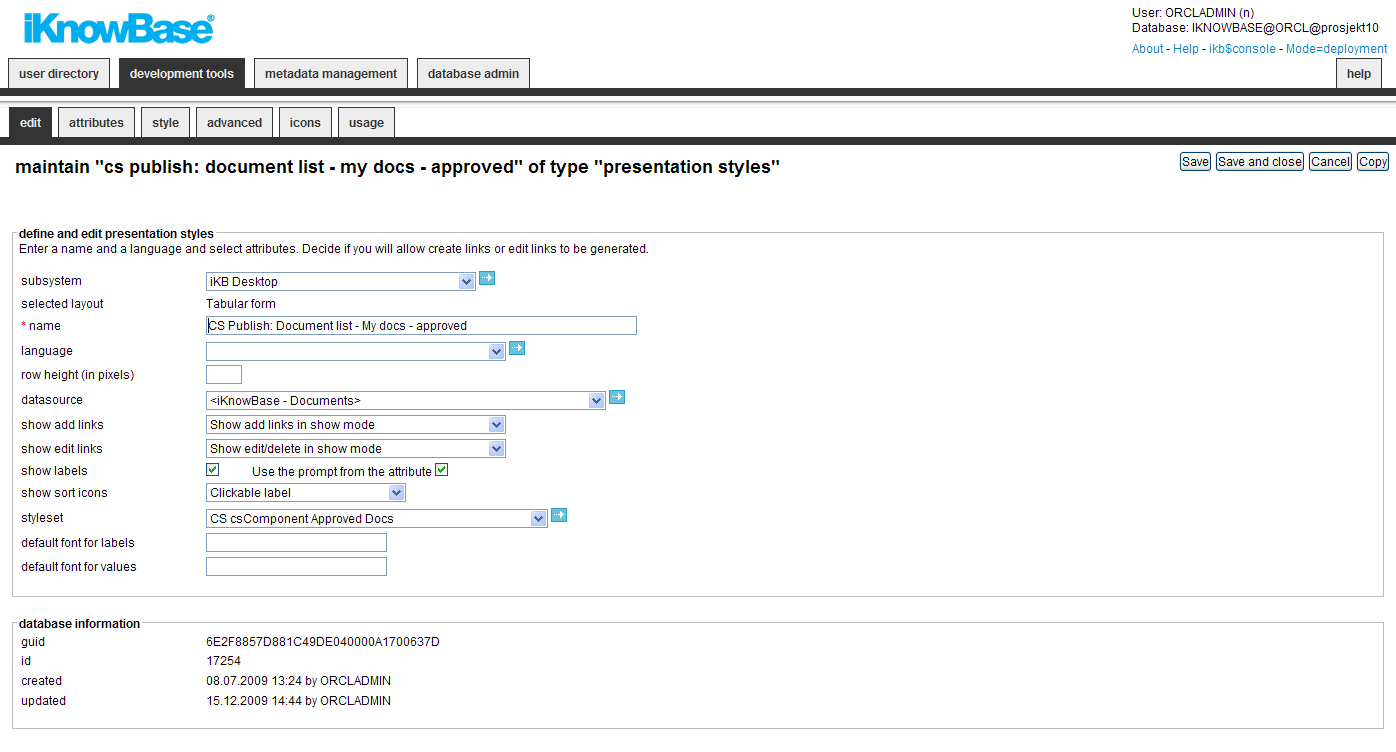
This section describes the properties of a tabular presentation style, as shown on the corresponding Edit pane.
| Property | Description |
|---|---|
| Subsystem |
Select the appropriate subsystem. |
| Selected layout |
Displays the type of presentation style. |
| Name |
Type a name for this tabular form presentation style. |
| Language |
Select the appropriate language for the form. If you do not select a language, it is automatically set according to: a) the user language, b) the browser language, c) the domain language in the given order. |
| Row height (in pixels) |
Type the height of each row (one row per document). |
| Datasource |
Select the appropriate data source for this presentation style. The following data sources are available:
In addition to these data sources you will also have access to select all defined external data sources. |
| Show Add links |
Specify whether to generate links to add new documents or not. The links is placed above the extracted documents at runtime.
The following options are available:
|
| Show Edit links |
Specify whether to generate icons to modify and delete documents or not.
Note: You need to select the appropriate attributes, such as
The following options are available:
|
| Show labels |
Select the check box to display the labels for the attributes that you select. Note: You also have to specify for which attributes to display labels in the Style tab. |
| Use the prompt from the attribute |
Select the check box to retrieve the labels from the attribute definition. |
| Show sort icons |
Specify whether it should be possible to sort the tabular list, either by clicking on the label or on the sort icons, or not. |
| Styleset |
If you want to use a style set to render HTML that surrounds the output from this presentation style, select the appropriate styleset here. |
| Default font for labels |
Type a default font class for the labels. You can change the font class for each attribute in the Style tab. |
| Default font for values |
Type a default font class for the. You can change the font class for each attribute in the Style tab. |
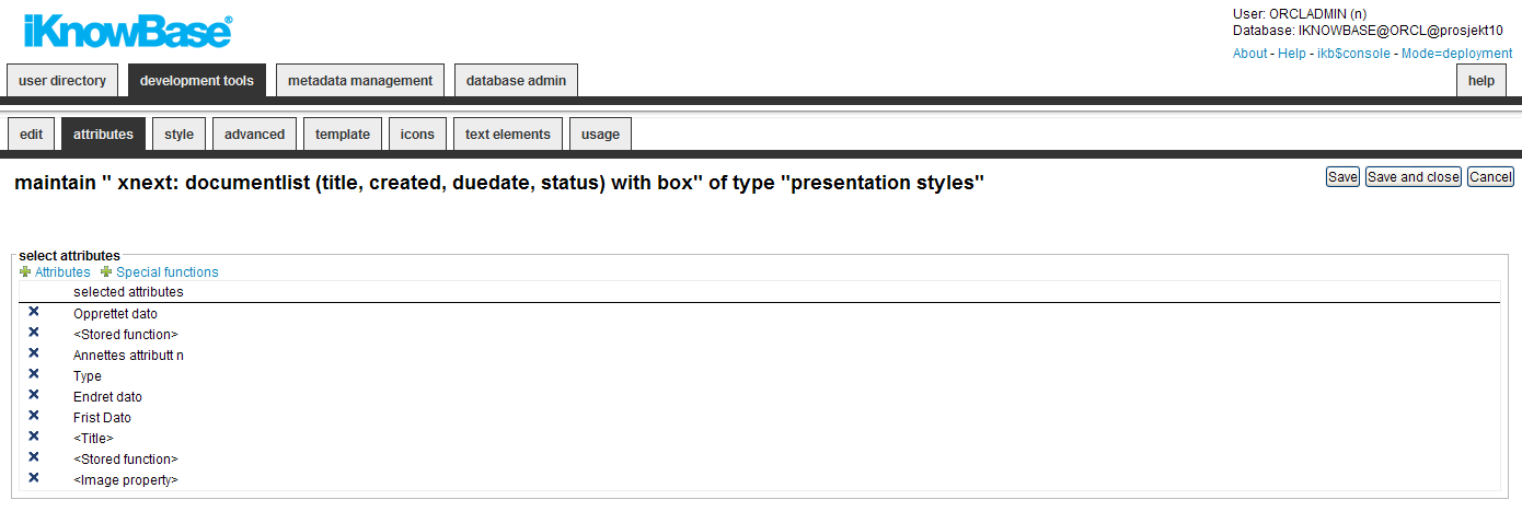
On the Attribute tab you can select the attributes to be used in the presentation style. This screen is the same for all three presentation styles and will only be described here.
| Property | Description |
|---|---|
| Availables |
This property lists all regular attributes that are associated with the data source that you have specified for this presentation template. Some of the attributes available from iKnowBase content store data sources are in fact special functions. |
| Special functions |
Displays the list of special functions described later in this chapter. You can reorder the attribute list by using drag and drop in each line. You can deselect attributes by clicking on the delete icon and save the data. |
| Property | Description |
|---|---|
| <Title> |
This attribute is used to displays the title field. You can specify how you want to view the attributes on the Advanced tab. You can select this attribute several times. |
| <Blank line> |
Displays a blank line in a free-form presentation style. Note: Only applicable to free-form presentation styles. |
| <Space> |
Displays a blank character in a free-form presentation style. Note: Only applicable to free-form presentation styles. |
| <Add links> |
Displays any quick links in a Shared content viewer or Search source portlet. Note: Ensure that the Show Add links property is set to show the links. |
| <Links> |
This attribute is used to create links for an attribute. To define a link, you must specify a target page and the attribute that you want to send as a value. |
| <Text/image> |
This attribute is used to add HTML codes or images. Note: Only applicable to free-form presentation styles. |
| <Add subdocument> |
This attribute is used to create a link to a form. The document that is created from the form opened from this link becomes a subdocument. |
| <Image Property> |
Will try to extract from the image itself this property |
| <XML Content> |
Will try to extract the XML_DATA column on the document and return it as a xmltype. |
| <Image properties (XML)> |
Retrieve as XML the image properties. The format will always start with a
|
| <Stored function> |
This attribute is used to call a database function. You can use this attribute when information is not directly available in the extracted document, but needs to be retrieved from the database. For example, display the author’s department where the department is not a part of the extracted document. This attribute is divided between the following two types that can be selected from the Advanced tab: There are two different types of functions:
|
| <Edit> |
This attribute creates a link to form, which may be used to edit the document. Note: Ensure that the Show Edit links property is set. To display the links, the user must have access to update the document. |
| <Edit document> |
This attribute opens Microsoft Word, PowerPoint, or Excel to update the file-content of the document. Note: Ensure that the Show Edit links property must be set. To display the links, the user must have access to update the document, and the document contain a Microsoft Office document. |
| <Change information type> |
This attribute generates an icon or link that opens a dialog box to select a new information type. Note: You must configure this attribute in the Advanced tab with a quick link that displays the forms for the information types that can be selected. For these forms you must ensure that the Save information type on update property is selected. |
| <Check in/out> |
This attribute generates an icon or link to use the check-in and check-out (CICO) functionality. Note: You must activate CICO for the appropriate information types. The links will only be displayed for information objects of these types. An information object with activated CICO will not be available for edit until the user checks it out. It will not be available for checkout if already checked out by another user. The user is given one of the following messages:
|
| <Delete> |
This attribute creates a link that opens a dialog box to delete the document. Note: Ensure that the Show Edit links property is set. To display the link, the user must have access to delete the document. |
| <Number Read> |
This attribute displays the number of times the document is read. Note: To enable use of this special function attribute, configure the appropriate information types to store statistics ( Statistics property). |
| <Score> |
This attribute displays a score from the Oracle text, while searching for free text. The score may be used to sort the list so that most significant documents are displayed at the top of the list. |
| <Show HTML> |
This attribute displays an icon that can generate HTML code for the document content. |
| <Show levels in a structure> |
This attribute displays the level in a document structure. The usage is restricted to viewers extraction sub documents by a connect-by clause. |
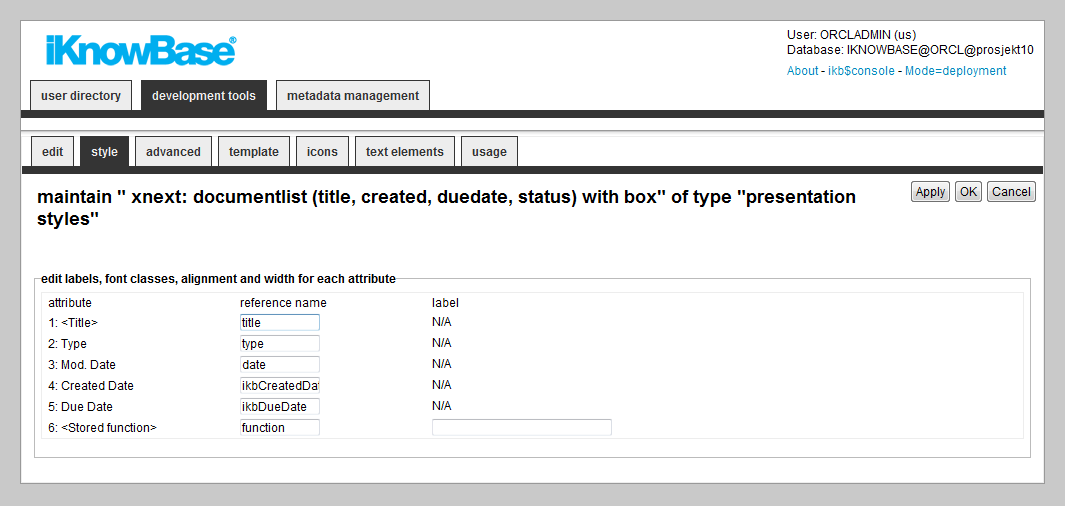
On the Style tab you can change labels, font classes and other visual qualities.
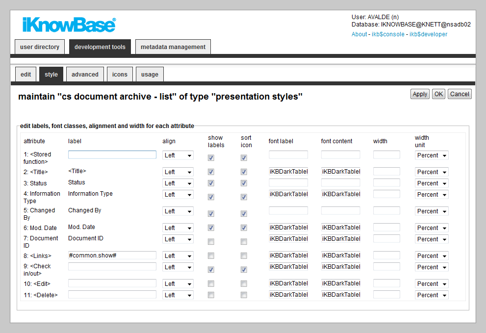
| Property | Description |
|---|---|
| Attribute |
Displays the list of selected attributes. |
| Label |
Type the label that you want to display for the specific attributes. This property will be used when you have chosen to show label for the attribute, and chosen not to use the prompt from the attribute definition. You may use HTML codes in this field. Note: This property doesn�t have language support. You may use labels stored in the NLS tables to achieve this. The syntax is #ObjectId.StringId#, where ObjectId is the value in the IKB_NLS_STRING.OBJECT_ID column and StringId is the value in the IKB_NLS_STRING.STRING_ID column. The NLS tables may be overwritten in case of an upgrade. |
| Align |
Select the appropriate alignment. |
| Show labels |
Select this check box to print the label for this attribute. Note: Select the Show labels check box on the Main tab to make this property visible on the Style tab. |
| Sort icon |
Select this check box to display the sort icons for this attribute. Note: Select one of the sort-options for the Show sort icons property on the Main tab to make this property visible. |
| Font label |
Type the style class for the label. Note: When you specify a standard font for labels, this value appears as a suggestive value. |
| Font content |
Type the style class for the value field. Note: When you specify a standard font for values, this value appears as a suggestive value. |
| Width |
Type the width of the TD cell. |
| Width unit |
Select the appropriate unit for the width property. Available units are percent and pixels. |
On the Advanced tab you can specify the sorting, whether display or hide the values, and special features associated with some of the attributes.
Which regions are available on the tab is dependent on which attributes that are selected for the presentation style.
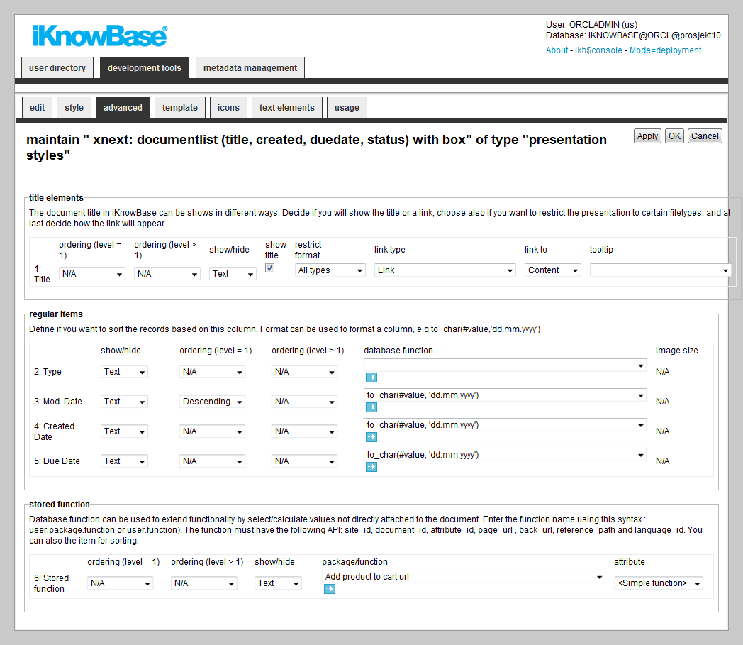
| Property | Description |
|---|---|
| Title elements | |
| Ordering (level = 1) |
Select the appropriate sort order. This will apply to the first level (default) if running a traversing viewer. |
| Ordering (level > 1) |
Select the appropriate sort order on the siblings. This will only apply when running a traversing viewer. |
| Show/Hide |
Select whether to display or hide the title attribute. |
| Show title |
Select this check box to display the document title itself. Rather that displaying the document title, you can display a label or image for the title attribute. For this, you must define the label or image in the Label property on the Style tab. |
| Restrict format |
Select the appropriate format restriction.
|
| Link type |
Select the appropriate link type.
|
| Link to |
Select the appropriate option to display the document when the user clicks on the title link.
|
| Tooltip |
Select the appropriate tooltip function. You can use tooltips to preview an image or display details of a document. Tooltips are displayed when you move the mouse over the title link. The functionality for displaying tooltips are implemented by the javascript library cluetip combined with PL/SQL functions.
To add new functions you can write your own PL/SQL-function, add it as a database command and use it in the presentation style layer. Use e.g the function ikb_tooltip.cluetip_preview as an example. |
| Regular items | |
| Show/Hide |
Select whether you want to display or hide the attribute. |
| Ordering (level = 1) |
Select the appropriate sort order. This will apply to the first level (default) if running a traversing viewer. |
| Ordering (level > 1) |
Select the appropriate sort order on the siblings. This will only apply when running a traversing viewer. |
| Database function |
By default, iKnowBase applies a default format to the item being displayed. If you want to customize this output, create a database function and use that for column formatting. Normally, you will not need to use a function. For more information on properties of database function, see Properties. |
| Image size |
Select the appropriate size for the image attribute. This property is available only for image attributes. |
| Links | |
| Link to |
Select the attribute value to pass as parameter. |
| Text source |
Select the text to be displayed on the link. Available options are the label for the
|
| Target |
Select the target to use for the link. |
| Image |
Type the path of an image to use as the link. This will override Text source. The text specified in Text source will be used as tooltip for the link. The image must be placed under the resource directory. |
| Stored function | |
| Ordering (level = 1) |
Select the appropriate sort order. This will apply to the first level (default) if running a traversing viewer. |
| Ordering (level > 1) |
Select the appropriate sort order on the siblings. This will only apply when running a traversing viewer. |
| Show/hide |
Select whether to display or hide the title attribute. |
| Package/function |
Select the database function. |
| Attribute |
Select the attribute to pass as parameter to the database function. Use the option
Note: If the function is not a simple function, it must have the signature described in
|
| Text/image | |
| Image |
Type the path of an image. For example, /resource/image.gif. The image appears instead of the label. |
| Height |
Type the height of the image in pixels. |
| Select quick link |
Select the appropriate quick link to use for this link/icon. Applicable to
|
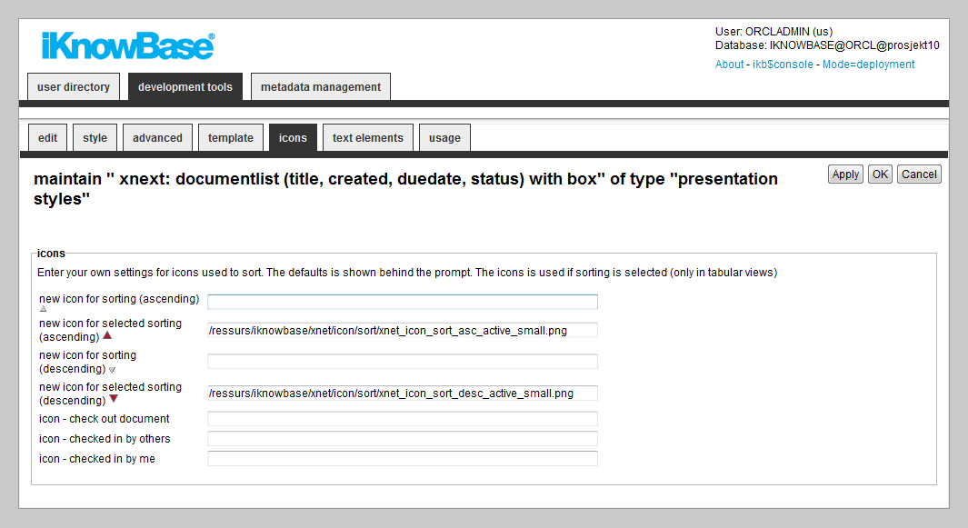
| Property | Description |
|---|---|
| New icon for sorting (ascending) |
Enter the path of the icon for an unselected ascending sort, for example /resource/icons/sortxx.png. |
| New icon for selected sorting (ascending) |
Enter the path of the icon for a selected (active) ascending sort, for example /resource/icons/sortxx.png. |
| New icon for sorting (descending) |
Enter the path of the icon for an unselected descending sort, for example /resource/icons/sortxx.png. |
| New icon for selected sorting (descending) |
Enter the path of the icon for a selected (active) descending sort, for example /resource/icons/sortxx.png. |
| Icon – Check out documents |
Enter the path of the icon for the “check out documents” command. You can click the icon and check out a document. |
| Icon – Checked in by others |
Enter the path of the icon to display this status. A ToolTip displays the name of the user who checks in a document and the time of check-in. |
| Icon – Checked in by me |
Enter the path of the icon to display this status. You can click the icon and check in a document. |
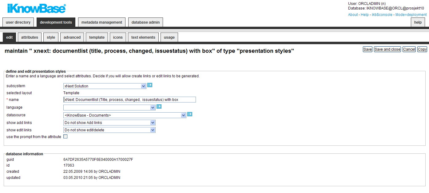
This section describes the properties of a template-based presentation style, as shown on the corresponding Edit pane.
| Property | Description |
|---|---|
| Subsystem |
Select the appropriate subsystem. |
| Selected layout |
Displays the type of presentation style. |
| Name |
Type a name for this tabular form presentation style. |
| Language |
Select the appropriate language for the form. If you do not select a language, it is automatically set according to: a) the user language, b) the browser language, c) the domain language in the given order. |
| Path to template |
If you want to use a file-based template (not recommended), enter the file path here. The file must be available to the application server on this path. Normally, this value will be blank. |
| Datasource |
Select the appropriate data source for this presentation style. The following data sources are available:
In addition to these data sources you will also have access to select all defined external data sources. |
| Show Add links |
Specify whether to generate links to add new documents or not. The links is placed above the extracted documents at runtime.
Note: You need to specify which links to generate in the viewer or search source configuration (on the quick links tab on the Edit pane), and select the
The following options are available:
|
| Show Edit links |
Specify whether to generate icons to modify and delete documents or not.
Note: You need to select the appropriate attributes, such as
The following options are available:
|
| Use the prompt from the attribute |
Select the check box to retrieve the labels from the attribute definition. |
| Guid |
Displays a globally unique identifier number for this component. This property appears after you save a component. You cannot update the information of this property. |
| Id |
Displays a unique identifier number for this component. This property appears after you save a component. You cannot update the information of this property. |
| Created |
Displays when the component was created and by whom it was created. |
| Updated |
Displays when the component was last updated and by whom it was updated. |
| Property | Description |
|---|---|
| Attribute |
Displays the list of selected attributes. |
| Reference name |
Type the reference name of the attribute. If you want to identify the attribute in the template, you must provide a reference name. This reference name must be unique. |
| Label |
Type the label that you want to display for the specific attributes. Note: It is recommended to use text elements rather than the Label property. This property doesn’t have language support. |
| Property | Description |
|---|---|
| Title elements | |
| Ordering (level = 1) |
Select the appropriate sort order. This will apply to the first level (default) if running a traversing viewer. |
| Ordering (level > 1) |
Select the appropriate sort order on the siblings. This will only apply when running a traversing viewer. |
| Show/Hide |
Select whether to display or hide the title attribute. |
| Show title |
Select this check box to display the document title itself. Rather that displaying the document title, you can display a label or image for the title attribute. For this, you must define the label or image in the Label property on the Style tab. |
| Restrict format |
Select the appropriate format restriction.
|
| Link type |
Select the appropriate link type.
|
| Link to |
Select the appropriate option to display the document when the user clicks on the title link.
|
| Tooltip |
Select the appropriate tooltip function. You can use the tooltip to preview an image or display the details of a document. New tooltip functions may be implemented as PL/SQL functions. Have a look at IKB_TOOLTIP.SHOW_ADVANCED_TOOLTIP_INGRESS as an example implementation. Register the new functions in the database table IKB_TOOLTIP_FUNCTION to make them available in the dropdown box. |
| Regular items | |
| Show/Hide |
Select whether you want to display or hide the attribute. |
| Ordering (level = 1) |
Select the appropriate sort order. This will apply to the first level (default) if running a traversing viewer. |
| Ordering (level > 1) |
Select the appropriate sort order on the siblings. This will only apply when running a traversing viewer. |
| Database function |
By default, iKnowBase applies a default format to the item being displayed. If you want to customize this output, create a database function and use that for column formatting. Normally, you will not need to use a function. For more information on properties of database function, see Properties. |
| Image size |
Select the appropriate size for the image attribute. This property is available only for image attributes. |
| Links | |
| Link to |
Select the attribute value to pass as parameter. |
| Text source |
Select the text to be displayed on the link. Available options are the label for the
|
| Target |
Select the target to use for the link. |
| Image |
Type the path of an image to as the link. This will override Text source. The text specified in Text source will be used as tooltip for the link. The image must be placed under the resource directory. |
| Stored function | |
| Ordering (level = 1) |
Select the appropriate sort order. This will apply to the first level (default) if running a traversing viewer. |
| Ordering (level > 1) |
Select the appropriate sort order on the siblings. This will only apply when running a traversing viewer. |
| Show/hide |
Select whether to display or hide the title attribute. |
| Package/function |
Select the database function. |
| Attribute |
Select the attribute to pass as parameter to the database function. Use the option
Note: If the function is not a simple function, it must have the signature described in
|
| Text/image | |
| Image |
Type the path of an image. For example, /resource/image.gif. The image appears instead of the label. |
| Height |
Type the height of the image in pixels. |
| Select quick link |
Select the appropriate quick link to use for this link/icon. Applicable to
|
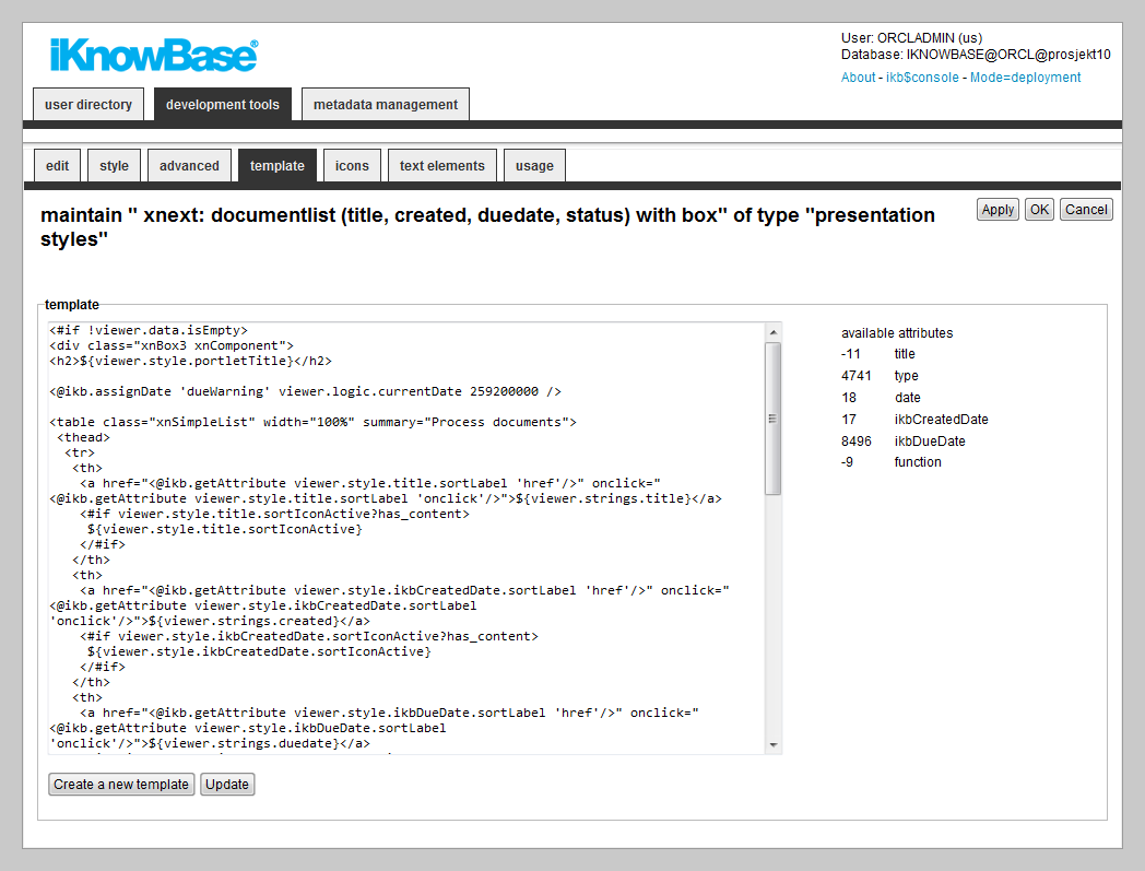
iKnowBase enables you to design and create the template-based presentation style layout using your own FreeMarker template. See the FreeMarker reference chapters for information about iKnowBase-specific model objects available for use in the FreeMarker template.
Note: If you update the selected attributes in the presentation style, you must also update the FreeMarker template to reflect the changes. You can generate a new template or manually update the template.
There are two action buttons available:
| Property | Description |
|---|---|
| Template |
Type the FreeMarker template code. |
| Available attributes |
A list of available attributes and their IDs available for use in the HTML template code. |
| Property | Description |
|---|---|
| New icon for sorting (ascending) |
Enter the path of the icon for an unselected ascending sort, for example /resource/icons/sortxx.png. |
| New icon for selected sorting (ascending) |
Enter the path of the icon for a selected (active) ascending sort, for example /resource/icons/sortxx.png. |
| New icon for sorting (descending) |
Enter the path of the icon for an unselected descending sort, for example /resource/icons/sortxx.png. |
| New icon for selected sorting (descending) |
Enter the path of the icon for a selected (active) descending sort, for example /resource/icons/sortxx.png. |
| Icon – Check out documents |
Enter the path of the icon for the �check out documents" command. You can click the icon and check out a document. |
| Icon – Checked in by others |
Enter the path of the icon to display this status. A ToolTip displays the name of the user who checks in a document and the time of check-in. |
| Icon – Checked in by me |
Enter the path of the icon to display this status. You can click the icon and check in a document. |
The properties on this tab enable you to define texts to be used in the component. The texts are available as FreeMarker model objects. Multiple languages are supported.
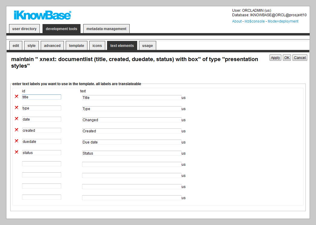
| Property | Description |
|---|---|
| Id |
Type an identifier for the label. |
| Text |
Type the text labels that you want to use in the template. If multiple languages are supported in the solution, clicking on the text box will display one text box per language, for easy editing. |
The free form presentation style is only available for backward compatibility purposes; this document therefore does not fully describe this feature.
The FreeForm presentation style does not apply any of its own HTML formatting on the content. Instead, you need to use the property
<Text/image> to enter the HTML formatting you want. At runtime, the viewer will output the formatting specified on the Style tab for each document in the source content.
| Previous | Top | Next |
| Parameter | Preview Pages |